Google encourages its user community to participate in developing Maps by requesting new features. Many app and website owners communicated the need for styling options to build more informative maps for their users. The idea was to engage users and keep them informed by presenting crucial information as data displayed on maps. Such data styling would be achieved by highlighting particular regions and information. Solutions that already existed were neither easy to implement nor cost-efficient, as they required purchasing, updating, and maintaining boundary data. Therefore, Google decided to once again empower its users and announced their new Data-driven styling for the Maps JavaScript API, enabling you to display and style boundaries on Google Maps!
About Data-driven styling
Thanks to Data-driven styling, you can style maps on your website or in your app and visualize useful information for your users. You can visualize your internal data, such as information about your store inventory, or publicly available data, such as election results.
Data-driven styling brings an option for easily displaying shapes over administrative boundaries on maps as well as creating customized choropleth maps using your own business data together with Google’s administrative boundaries. This allows you to increase user engagement and experience – users can make informed decisions, save their time, and get insights about areas they’re interested in.
What can Data-driven styling be used for?
You can use Data-driven styling to visualize data on maps at companies across different industries, such as insurance, travel, media, government, education, etc. Google prepared a demo presenting some f the use cases, including:
- Marking areas to help users visualize the location of a certain place, such as a land plot, hotel, or store.
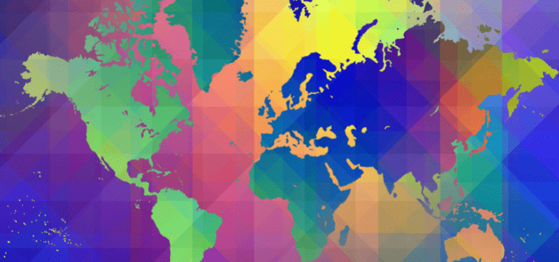
- Creating choropleth maps using Google data or your own tabular data. A choropleth map can display data such as COVID-19 cases, home prices, or election results in different countries, localities, or neighborhoods.
- Supporting user interaction – when a user clicks on the map, it returns metadata such as a Place ID, feature type, and display name to your apps. This feature allows you to keep your users satisfied by restyling the map based on their interactions.
How can you enable Data-driven styling?
To enable styling, choose feature layers for a new or existing Map Style in the Google Cloud Console. Associate your chosen style with a Map ID with an enabled vector map for JavaScript.
Then you need to apply a FeatureStyleOptions object or FeatureStyleFunction to a feature layer in your code. For each layer, you can customize fill and stroke color, fill and stroke opacity, and stroke weight.
Areas covered by Data-driven styling
In the preview release, Data-driven styling is available for administrative areas such as countries, localities, postal codes, etc.
Visit the Google website to find supported countries and features. Google will continue to add further areas – if you can’t find a country or feature type you need, provide your feedback through Google’s Issue Tracker.
How can you get started?
Data-driven styling is available for Dynamic Maps for Maps JavaScript API. Developers can use styling by creating a MapID configured by a JavaScript Vector Map in Google Cloud Console. In the future, Google plans to add further features that will bring even more customized data visualizations for your users.
Check out Google’s documentation and try out Data-driven styling! If you have any questions or need some help, don’t hesitate to contact our Google Maps experts 🙂
source: https://cloud.google.com/blog/products/maps-platform/introducing-data-driven-styling